Project overview
DESIGNING A QUIZ-TAKING WEBSITE FOR AN ONLINE UNIVERSITY
The problem: During quiz taking, students with poor internet connection have a bad experience in taking quizzes and thus making it not enjoyable and smooth.
The goal: The goal is to ensure all students have enjoyable and smooth quiz taking online without any issues with the internet.
The product:
Quizler is an online quiz taking flow for a university.
Typical user is from age 18 and above who is in an online university. The goal is to make quiz taking smooth and easy
Project duration: 26 July, 2022 - 14 August 2022
My role: UX designer leading the website design
Responsibilities: Conducting interviews, paper and digital wireframing, low and high-fidelity prototyping, conducting usability studies, accounting for accessibility, iterating on designs and responsive design.

Understanding the user
USER RESEARCH SUMMARY
I conducted user interviews, which I then turned into empathy maps to better understand the target user and their needs. I realized that many target users complain about internet being unstable as the main problem they face.
This is very important to them because it is frustrating to them when it happens.
PAIN POINTS
Quality: Users with poor internet quality tend to be frustrated, this causes some students to be unable to finish quiz on time and submit.
e.png)
Problem statement:
Anna is an online university student
who needs to do her quizzes without internet issues
because it will allow her to focus on the question and be able to complete on time.
User journey map:
I created a user journey
map of Anna’s experience using the site to help identify possible pain points and improvement opportunities.

Site map
My goal here was to make strategic information architecture decisions that would improve overall website navigation. The structure I chose was designed to make things simple and easy.

Starting the design
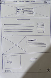
Paper wireframes
Here, I sketched out paper wireframes for each screen on my website, keeping the user pain points about unstable internet in mind, I made inquiries with a software engineer which gave me a great idea on how I could design and help users with internet issues.


Digital wireframes
Moved from paper to digital wireframes, from my understanding of user pain points the button would help improve the user experience or better yet eliminate user pain point.

This toggle button is going to help keep the internet stable during quiz taking.
Digital wireframe screen size variations

Low-fidelity prototype
To create a low-fidelity prototype, I connected all the screens involved in the primary user flow of logging in and taking a quiz.
Here, I had received feedback on my designs so I made sure to listen to their feedback, and I implemented suggestions in places that addressed user pain points.
.png)
Usability study: findings
Navigation: Users became confused when they needed to take a quiz; instead of logging in first, they tapped on the "Quiz" option in the navigation bar. The same issue occurred with other navigation options.
Refining the design
Before usability study
Mockups
Based on the insights from the usability study, I made changes to improve the site's quiz taking flow. One of the changes I made was removing the option to “check grades” and other navigation to only login first

After usability study

Mockups: Original screen size
Mockups: Screen size variations
High-fidelity
prototype
My hi-fi prototype followed the same user flow as the lo-fi prototype, and included the design changes made after the usability study, as well as several changes suggested by members of my team.
Accessibility considerations


1.I used headings with different sized text for clear visual hierarchy
2.Designed the site with alt text available on each page for smooth screen reader access
3.I used landmarks to help users navigate the site, including users who rely on assistive technologies
Going forward
Takeaways
Impact:
Our target users shared that the design was intuitive to navigate through.
What I learned:
I learned that even the navigation bar could be misleading depending on what I am designing
1.Conduct follow up usability testing to determine whether the stable internet button actually helps users have a smooth internet
2.Identify any additional areas of need and ideate on new features
Next steps
Thank you for taking time to review my work. In case you have further questions please contact me
Email: boachiejoel@gmail.com